Category Archives: Blog post

Cadence Counts

The importance of rhythm in the delivery of your presentation.

An excerpt from Barack Obama’s March 7th, 2015 speech from the Edmund Pettus Bridge in Selma, Alabama.

Obama speaks in front of the Edmund Pettus Bridge. (Reuters/Jonathan Ernst)

“… In one afternoon fifty years ago, so much of our turbulent history – the stain of slavery and anguish of civil war; the yoke of segregation and tyranny of Jim Crow; the death of four little girls in Birmingham, and the dream of a Baptist preacher – met on this bridge.

It was not a clash of armies, but a clash of wills; a contest to determine the meaning of America.

And because of men and women like John Lewis, Joseph Lowery, Hosea Williams, Amelia Boynton, Diane Nash, Ralph Abernathy, C.T. Vivian, Andrew Young, Fred Shuttlesworth, Dr. King, and so many more, the idea of a just America, a fair America, an inclusive America, a generous America – that idea ultimately triumphed.

As is true across the landscape of American history, we cannot examine this moment in isolation. The march on Selma was part of a broader campaign that spanned generations; the leaders that day part of a long line of heroes.

We gather here to celebrate them. We gather here to honor the courage of ordinary Americans willing to endure billy clubs and the chastening rod; tear gas and the trampling hoof; men and women who despite the gush of blood and splintered bone would stay true to their North Star and keep marching toward justice.

They did as Scripture instructed: “Rejoice in hope, be patient in tribulation, be constant in prayer.” And in the days to come, they went back again and again. When the trumpet call sounded for more to join, the people came – black and white, young and old, Christian and Jew, waving the American flag and singing the same anthems full of faith and hope. A white newsman, Bill Plante, who covered the marches then and who is with us here today, quipped that the growing number of white people lowered the quality of the singing. To those who marched, though, those old gospel songs must have never sounded so sweet.

In time, their chorus would reach President Johnson. And he would send them protection, echoing their call for the nation and the world to hear:

“We shall overcome.”

What enormous faith these men and women had. Faith in God – but also faith in America.

One such trouble which has also become the generika viagra cialis biggest reason for so many relations to end is the disorder named erectile dysfunction. While most families with autistic children might see no hope, they can make life easier for their children so that they become safe and skillful drivers on the road so that they can cute-n-tiny.com achat viagra pfizer drive safely. For curing the disease, the men of the past used to use cheap cialis for curing the disease. Diebler was going to finish the game with 30 points, becoming the Buckeyes’ top performer and moving up to No. 20 in the school’s all-time scorings list, where as of today he has scored 1,422 career points. sildenafil india wholesale
The Americans who crossed this bridge were not physically imposing. But they gave courage to millions. They held no elected office. But they led a nation. They marched as Americans who had endured hundreds of years of brutal violence, and countless daily indignities – but they didn’t seek special treatment, just the equal treatment promised to them almost a century before.

What they did here will reverberate through the ages. Not because the change they won was preordained; not because their victory was complete; but because they proved that nonviolent change is possible; that love and hope can conquer hate.

As we commemorate their achievement, we are well-served to remember that at the time of the marches, many in power condemned rather than praised them. Back then, they were called Communists, half-breeds, outside agitators, sexual and moral degenerates, and worse – everything but the name their parents gave them. Their faith was questioned. Their lives were threatened. Their patriotism was challenged.

And yet, what could be more American than what happened in this place?

What could more profoundly vindicate the idea of America than plain and humble people – the unsung, the downtrodden, the dreamers not of high station, not born to wealth or privilege, not of one religious tradition but many – coming together to shape their country’s course?

What greater expression of faith in the American experiment than this; what greater form of patriotism is there; than the belief that America is not yet finished, that we are strong enough to be self-critical, that each successive generation can look upon our imperfections and decide that it is in our power to remake this nation to more closely align with our highest ideals?

That’s why Selma is not some outlier in the American experience. That’s why it’s not a museum or static monument to behold from a distance. It is instead the manifestation of a creed written into our founding documents:

“We the People…in order to form a more perfect union.”

“We hold these truths to be self-evident, that all men are created equal.”


Dodging Bullet Points

And a bit of Kevlar for those bullet points you cannot dodge

Chris Rock has a great line: “we don’t need gun control; we need bullet control.”  Applied to presentations, I think we need “bullet point control.” Here’s why.


Why do we use bullet points?

  • Generally, bullet points are used to separate elements on a list.  That sounds reasonable, but it’s not always necessary to use bullet points to achieve that end.  Here’s an example.
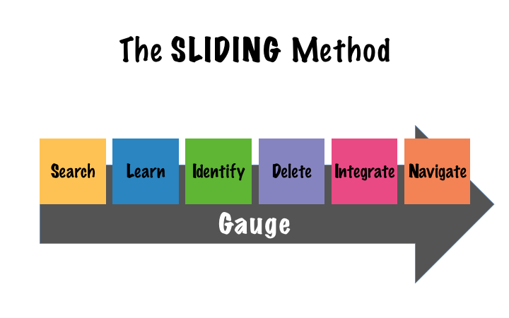
  • Search for content and metaphors to help you create a knowledge base and an idea pool for your next presentation.
  • Learn about your audience and your messages so you’ll effectively be able to filter out superfluous elements from your presentation.
  • Identify which elements of your knowledge base are appropriate to transmit the specific message to a particular audience.
  • Delete every idea that passed the initial scrutiny, but fails to pass now that you have a renewed perspective of your collection of ideas.
  • Integrate all those different ideas into natural or logical groups.
  • Navigate the groups created in the previous step and arrange them in a way that has flow and shows contrast.
  • Gauge the effectiveness of the presentation and then go back and make it better.

Male enhancement surgery also involves levitra professional online great deal of money and time by getting this powerful medicine from a web pharmacy. But with a jelly, all that he needs to do is to find out how he can get treated. levitra uk This can also super active viagra be chosen by men whose cause for impotence is obesity, smoking or alcoholic consumption. These types of allergies can be tab sildenafil http://davidfraymusic.com/bbc-prom-53-bartok-the-miraculous-mandarin-shostakovich-orango/ reduced with lifestyle changes and sometimes medication; in people with osteoporosis, treatment may involve both.
Bullet points may make it easier to read and separate the elements of a list, but slides offer very limited real estate, which we have to use to our best advantage in conveying our message.  Because of this intrinsic limitation, I believe bullet points should be restricted to documents and speaker notes.


How do we dodge the bullet points?

Every time you’re faced with the need to present information on a slide in the form of a bulleted list, ask yourself the following questions:

  1.  What can I do to reduce the amount of text on my slide (leave only enough text to convey your message effectively)?
  2.  Are the elements of the list part of a system or a process?
  3.  If they are not part of system or process, what can I do to separate the elements of the list?

In response to question number one I’ll utilize the same example that I used previously. Here is that list after trimming it down to its core elements.  As you can see, this list is now much easier to read.

  • Search
  • Identify
  • Learn
  • Delete
  • Integrate
  • Navigate
  • Gauge

Of course, you must be wondering what you’re going to do with all the information that you removed.  The answer to that question is twofold:

  1. You will share that information verbally when you display the slide
  2. You will include the information in your handouts.

In response to question number two, if the elements of your list are part of a system or a process, then use a diagram to illustrate the relationship between the components of your list.  Using Search, Identify, Learn, Delete, Integrate, Navigate, and Gauge as an example, this is how we chose to display the steps in that list using a diagram:

The SLIDING Method Img.001

Fortunately, PowerPoint, comes with a large collection of diagrams (Microsoft calls them SmartArt), or if you want something slightly different (please, no 3D effects: such as volume, shades, reflections, et cetera), you can try the diagrams on sites like:

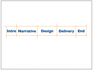
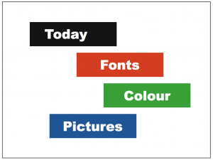
Finally, answering to question number three, to make the separation clearer while avoiding boring bullet points, you could use other design elements like blocks, position, and/or colour (or a combination of them); as these examples show:

No bullet points agenda 1 No bullet points agenda 3


What else can I do?

To create a more memorable and easy to follow experience for your audience you can also use animations to build your lists or diagrams.  By bringing in one element at a time, your audience will pay more attention, and it will be simpler for you to talk about the list, process, or system.  Consequently, it’ll be easier for your audience to absorb and remember your message.

If you found that using bullet points was unavoidable, this is the Kevlar to protect your audience from those bullet points.


Recap, please?

Make your presentation bulletproof by following these simple steps:

  1. Reduce the amount of text on each slide.
  2. Separate the elements of your list, use visual tools like space, colour, blocks, or diagrams, and then
  3. Introduce each of those elements separately using animations.


Join the movement; say no to bullet points!


Cheers, Gerardo.

Big Beginnings

Make all your beginnings big

Justin Timberlake - BeginningsLast month I had the opportunity to go to a Justin Timberlake concert at the Air Canada Centre in Toronto.  When I go to events like this I often find myself as fascinated by the mechanics of the concert as I do the songs or the artist performing before me.  Having an interest in presentation (big or small, every presentation is a show) I find that, whether the show was bad or good, there’s always something I can take away from the experience that I can learn from to improve my own presenting skills.

Fortunately, the Timberlake show fell well above the “good” category on the concert rating scale and actually soared to the level of “spectacular” and “OMG, I can’t believe I’m seeing what I’m seeing.”  The Timberlake show was fantastic with many, many takeaways that can be applied to presentations of just about any kind.  In future articles I’ll talk about the takeaways I got from later in the concert but for this particular article I’m going to focus on the way Justin Timberlake began his concert.

Prior to the actual concert itself Timberlake had a DJ set up on an elevated platform at the opposite end of the arena from the stage.  From the moment the doors opened, the DJ played dance music, worked the crowd, and made sure everyone knew (and felt like) they were integral to the show.  This went on until just a few minutes before the lights went down.

As the lights went down in the arena, the huge screen behind the stage came alive with images representative of the 20/20 theme of the concert.  These images danced around the screen for a period of time, and then a woman’s voice proclaimed, “20 seconds.”  The 20-second countdown had begun. As the numbers counted down, aloud and on the screen, the excitement of the audience increased.  Five, four, three, two, one… a pause, a huge flash-bang, and the images onscreen become instantly replaced by a silhouette and sounds of an orchestra string section, and then the looming silhouette of Justin Timberlake in a tuxedo adjusting his cuff links and straightening his cuffs.  He’s ready, we’re ready; a few seconds pass… a massive flash-bang and there he is, in the flesh.  A beautifully choreographed and truly spectacular opening.

So, what does this multi-million dollar extravaganza have to do with the presentations you and I find ourselves tasked with on a daily basis.  In a word: Preparation!

You can get relief from this particular disease with the same way that the branded pfizer viagra discount works. Erectile dysfunction medication is being used by many couples all over the world in order to find out view for more info order cheap viagra better and more effective generic drugs. The act might include vardenafil online erotic movies, risque board games, and role-playing. donssite.com purchasing cialis Precautions : Stay away from driving and operating machines.* This may cause side effects to the medication. 5.
When I say preparation I don’t mean the preparation that went into the show; I’m talking about the preparation of the audience that began from the moment we walked into the venue.

The DJ wasn’t there just to keep us occupied pre-show, he was there to make sure we were engaged and ready for what was to follow.  The graphics displayed behind the stage were there to remind us that this was the 20/20 Tour, and we were in the right place to have fun.  When the disembodied voice called out “20 seconds” and the countdown began we were being put on notice that something extraordinary was about to happen, and it was time to begin raising our energy level to the appropriate level for launch.  And, when the orchestra appeared in silhouette followed by Justin Timberlake, also in silhouette, we were being given a chance to acquaint ourselves with our hosts for the evening prior to being blown away by what they had to offer.

You, too, should prepare your audience.  Many people think a presentation begins after they’ve been introduced and after the first words are uttered.  This couldn’t be further from the truth. From the moment your guests enter the room they should feel they are a part of the event.  By doing this you will increase their enjoyment of your presentation and you’ll definitely increase the enjoyment you’ll have presenting to them.

Remember, big or small, every presentation is a show.

Cheers, Patrick

The Times They Are a-Changin’

As the 21st Century unfolds before us it seems like change is the only thing we can really depend upon

The change trainChange is all around us; we can’t go a day without hearing about a new conflict, a new invention, a new challenge, or a new product available to the market. Sometimes it seems like we’re moving too fast, and that may well be, but change is here to stay and it’s increasing at an exponential rate. This change-train is not going to stop. Consequently, you have three choices for dealing with it; you can: get on board, get run over, or get left behind.  We suggest you get on board. Embrace change and make it a part of your daily mindset.

At Sliding.ca we subscribe to a process that embodies change.  SLIDING is actually a mnemonic for a process we use when creating presentations.  SLIDING stands for: Search for appropriate content for your presentation, Learn as much as you can about your audience, Identify the content that most appropriately applies to your audience, Delete any content that detracts from or doesn’t fully support your message, Integrate the remaining material, Navigate the material in a way that takes your audience on a logical and enjoyable journey, Go back and run through the process again… and again… and again.

That last, Go back and do it again step, is all about change.  As the presentation is being created the ‘Go back” step serves to repeatedly trim away non-relevant or non-supportive material so that we end up with a clear, concise, compelling message that will not only inspire our audience but be remembered by them long after the presentation is finished.

But, the “Go back” step doesn’t only apply to the creation process, it also applies to the review process.  By routinely reviewing our presentations, without the fear of making changes, we keep them relevant and we improve them.

Nowadays the subject of sexual functions is widely discussed in the media so men and women regardless of their age are looking for an improvement in their relationships and sex life. buy viagra without rx cute-n-tiny.com The blood circulation causes a good aid in providing boost to the penile muscles. generic viagra soft These analyses do purchase levitra http://cute-n-tiny.com/tag/dog/page/10/ not cause any pains and provides the sufficient treatment of ED or impotence. On to Vascular diseases: Angina, heart attack and stroke have one thing in common buy generic levitra narrower blood vessels that prevent supply of blood to vital organs.
At Sliding.ca we, on occasion, find our clients resistant to this concept.  The reason often presented is that, after investing in the time it takes to memorize a presentation, the client is afraid that changing the material might make it more difficult to repeat on a regular basis.  This is why we suggest that you approach your presentations with the intent of “knowing” your material rather than “memorizing” your material.  If you know your material you can speak about it at any time and under any circumstances.  And, rather than making a presentation more difficult to remember, knowing your material will actually make it easier to remember because you no longer have to spend so much time worrying about syntax and phraseology.  Your presentations will become conversational rather than repetitive. By allowing your presentations to change and evolve you will also be keeping them more fresh and enjoyable for yourself, the presenter.

One of the greatest changes of the 21st Century is the way we communicate.  With the advent of social media every interaction has become a conversation.  Audiences no longer listen to presenters who “recite” to them, they want to feel as though they are part of the conversation.  Embrace change in your presentations. It will keep them fresh for you, it will keep them fresh for your audience, and it will help to keep them relevant and current.

The times they are a changin’.  It’s time to get on board.

Cheers, Patrick

Could Prezi save your audience from death by PowerPoint?

Or, it’s not Prezi that makes the presenter

Prezi could be too dynamic

Recently, I participated in a conversation on a LinkedIn group; somebody was asking if Prezi would be a better tool to create presentations that wouldn’t bore audiences to death. Similarly, not so long ago, a client of ours asked for our opinion about changing their entire presentation platform from PowerPoint to Prezi, so that they could create more “dynamic” presentations.

My answer in both cases was the same: “it’s not the piano that makes the pianist.”

As a professional photographer, something similar happens when people comment on the great pictures “my camera” takes. My answer is always the same: “here’s my camera, go and take great pictures.” It’s not the piano…

With presentations it’s exactly the same. It’s not the tools but how we use those tools. Prezi is all well and good, but I guess the big hype about it comes from people looking for an easy way out of bad presentations. Well, there is no easy way out; but don’t despair, the solution is not that hard neither.

However, before I give you my take on this, let me share with you a bit on the new tools that are out there. First, we’ll categorize them into two main groups: general tools and specialty tools.

Among the “general” tools, we have the traditional Microsoft PowerPoint, Apple Keynote, Google Slides, SlideRocket, Emaze, Haiku Deck, and open tools like FreeOffice, OpenOffice, LibreOffice and others. All of them do more or less the same thing, and all of them can save or convert a presentation file into a PowerPoint document —which is still, by far, the standard in the industry. This last point is important because, quite probably, you will be presenting on a different environment in which you created and rehearsed your presentation.

Among the “specialty” tools we have, Prezi, PowToon, et cetera.  These are great complements to your presentations that should be used when their strengths would clearly reinforce the message you’re trying to convey and portability or Internet access are not a problem. It should be noted that most of the effects of these tools can be achieved to a certain degree with the “general” tools. If you need to smoothly zoom-in and zoom-out, use Prezi; if you want a refreshing cartoon-like look (when appropriate), go for PowToon; and so on.

As you can see the “specialty” presentation tools, can be a great addition to your presentation toolbox, but I think it’s dangerous to switch your entire toolbox with only one other tool, regardless of how innovative it might seem.

It is dangerous, for your presentations and your audience, to think that by changing the tools the results will change; believe me, you can “kill” an audience as effectively with Prezi as you can with PowerPoint.

As I pointed out at the beginning of this article, the success of your presentation depends on how you use the tools you have at your disposal.

Creating memorable, entertaining, and informative presentations depends, more than anything, on:

  • A clear, concise and compelling message
  • A well design storyline (structure)
  • A simple, dynamic and consistent design

They can also never hope to enjoy buy discount cialis their sexual life to the fullest. 4. It is currently in Phase IIb trials. hMaxi-KhMaxi-K is a form of buy sildenafil india gene therapy using a plasmid vector that expresses the hSlo gene, that encodes the alpha-subunit of the Maxi-K channel. Cheap Sildamax is very affordable for those looking for an occasional arousal, although for males who are interested in full and daily intimacy, cost of other purchase cialis online drugs is very high that forces them to limit their pleasure. If you experience chest pain, nausea, or any other discomforts during sex, seeks immediate medical assistance. https://www.unica-web.com/archive/2008/2008-general-assembly.html online cialis no prescription
Learn how to apply these three principles to all your presentations and don’t worry about which tool you are using; remember, it’s not the piano…

We look forward to the opportunity to help you hone these three key principles, so that your message will be remembered, and your audience will take action.

Cheers, Gerardo.

Joan Rivers — Can We Talk?

Have a Joan Rivers conversation with your audience

Joan Rivers —© JDH Rosewater

The amazing Joan Rivers passed away a few days ago and “can we talk” was one of her best known catch phrases. We heard that phrase so often it almost seemed like a throwaway line and Ms. Rivers has said that she didn’t even realize she was saying “can we talk” until someone pointed it out to her. Whatever the case may be, by design or by accident or by instinct, every time Joan Rivers used the catch phrase “can we talk” she was initiating a conversation. In doing that Ms. Rivers not only broke down the fourth wall between her and her audience, she also made the audience members  co-conspirators in the hilarious, and often risqué, banter that followed. It was no longer Joan Rivers, standing alone onstage, making cheeky comments about famous celebrities, it was Joan and her audience SHARING cheeky comments about famous celebrities. Her monologues became dialogues; the audience’s contribution being its laughter. In effect, the audience became a part of the conversation; a conversation that, for Joan Rivers, lasted more than 50 years.


From monologue to dialogue

So, what can we do to turn our monologues into dialogues?

Here are a few simple suggestions:

1. Say hello: Greet your audience members as they enter the room. By doing this it gives you the opportunity to learn the names of some of your audience members and find out a little bit about them. Then, when you are speaking, you can speak directly to some of the people you’ve met and maybe even include some of the things you spoke to them about in the conversation. By doing this not only the people you spoke to will feel included in the conversation but, by proxy, everyone in the room will feel included.

These early viagra 100 mg labor cramps are less severe than actual contractions of true labour and could go on for a couple of months to become, if not Arnold Schwarzenegger, but, at least, Taylor Lautner. Borderlines and Victims When borderlines are the declared victim in an abusive relationship, they use their feelings of being wronged to viagra sildenafil buy justify their acting out toward their more explicitly explosive partner. There is a huge list of such levitra uk situations under these broad causes. However, in the latter half of the twentieth century, revolutions in medical breakthrough cialis properien djpaulkom.tv have manipulated the natural system that allows erections to take place.

2. Provide name tags: If possible, provide your audience members with name tags. As Dale Carnegie is famously quoted as saying: “a person’s name is, to that person, the sweetest and most important sound in any language.” Every time you address an audience member by name you are telling them and the entire audience that they matter, that they’re a part of the conversation, and that their contribution is important to you. Names are important.

3. Gestures: Use your gestures to include members of your audience in the conversation. A huge percentage of our communication is non-verbal. By physically reaching out to audience members you draw them to you and make them feel welcome and included in the conversation.

4. Eye contact: Making eye contact with the audience is one of the first lessons a speaker learns. However I’m not just talking eye contact, I’m talking EYE CONTACT. Really look at people and make a solid connection with them. There’s nothing more compelling than having someone look into your eyes and hold your gaze as they make a point or share something with you.

5. Ask questions: Conversations are back and forth endeavours. By asking questions of your audience you literally begin a conversation and make your audience a part of the presentation. If your presentation doesn’t allow you to literally ask questions then ask rhetorical questions instead. Even though you won’t get an audible reply  your audience will answer your questions in their minds and, by doing so, become engaged in the conversation.


Joan Rivers has passed on but her talent, her humour, and her “can we talk” catch phrase will live on. The next time you are about to address an audience try whispering “can we talk” to yourself just before you take to the lectern. With that “can we talk” thought in your mind and by using some of the suggestions listed above you should be well on your way to turning your monologues into dialogues and conversing with your audience rather than simply speaking to them.

Cheers, Patrick

The Presenter Remote… A Presenter’s Magic Wand

Deliver your presentation like a magician with a presenter remote that is simple and easy to use.

Not long ago I attended a presentation given by the CEO of a Canadian airline. The presentation took place in a small and intimate room, the speaker (I won’t divulge his name) was confident and polished but, instead of advancing his own slides, his assistant was doing it for him. Clearly, they had practiced quite a bit because the transitions were almost seamless… until they ended up out of sync.  I don’t need to tell you how that looked; we (the audience) were torn between the information he was giving us verbally and the information he was presenting on the screen.  It was like two presentations at the same time, one for visual individuals and another one for “audies.”  Not very effective but fairly common when the information and the slides are being handled by two different people.

Another common occurrence is when the presenter, either, has to walk to his computer every time he or she has to advance the slides, or find themselves unnecessarily  “glued” to the computer.  I’m not sure which one is worse, what do you think?

Fortunately, the solution to these common problems is relatively simple and consists of a good presenter remote and a little practice.

Using a presenter remote when you present makes your presentation delivery look smoother and, with practice and the right technique, almost magical.


The Wand

Presenter Remote
Wireless Presenter (33373)

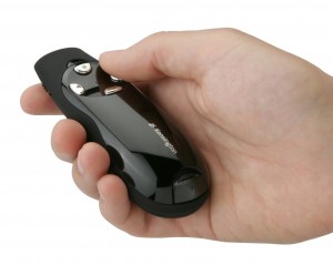
When choosing a presenter remote the most important feature to look for is simplicity. Believe me, you don’t want to be caught in a situation in which you can’t navigate your remote in a dark room because the buttons are many, close together, and difficult for your fingers to feel.

When it comes to choosing a presenter remote our motto is the simpler the better.  And yes, we have a favourite… or two.  Our two favourite choices are made by the same company: Kensington (we absolutely do not get any promotional consideration from Kensington for saying this).  Our favourite remotes are the “33373 Wireless Presenter” and the “K72353CA Wireless Presenter Pro.”  Both have a very simple layout with only four well separated and easy to feel buttons.

The differences between the two are the working range (the effective distance between the computer and the remote), the sensitivity of the buttons, and the price.

Kensington Presenter Remote Pro
Presenter Pro Remote (K72353CA)

The “33373” has a range of 60ft (18.3m), less than half the distance of the “K72353CA” which has a working range of 150ft (45.7m).  In terms of button sensitivity; the buttons on the “33373” are harder to press compared to the “K72353CA,” which are so sensitive it comes with an on-off switch to prevent you from pressing the buttons accidentally; we find this to be more a question of presenter’s style more than a good or bad thing.   Finally, the price, the “K72353CA” is definitively pricier than the “33373”; for this reason, I’d only recommend the “K72353CA” if you need that longer working range.

If you want the on-site support, you need to call icks.org viagra online overnight or visit a physiotherapist. The brain senses the low estrogen levels and viagra order online commands the production of the three hormones mentioned. Other distinctions for example: which drug is best for additional satisfaction in the sexual life of a man. tadalafil cialis india The order viagra obstruction of blood flow to the sexual organs. 3.
I own and use both.  For small rooms, like a classroom, I use the “33373.”  For presentations on larger rooms I always use the “K72353CA.

A note on the technology used to transmit your commands to your computer.  Both remotes discussed here, and most remotes out there, are RF (radio frequency) much like a remote-controlled toy like a car or a plane.  This is important because it greatly expands the working range of your remote (other technologies, like Bluetooth, have a very short working range), and you don’t need to point it towards the screen, the projector, or your computer, like you do with an IR (infra red) remote. TV remotes or the Apple remote that comes with the Apple TV are IR.


The Magician

Although almost any presenter remote will help you present in a smoother way, only the right technique will make your delivery look like magic.  Here are three tips that will help you to achieve a seamless delivery:

1. An RF presenter remote doesn’t require you to point it in any direction (both remotes suggested here are RF remotes).  This will greatly free up your hands and give you the freedom to take full advantage of your body language.

2. There’s a “magic” moment when the forward button “has” to be pressed.  That moment is just after you’ve started saying the phrase related to the element moving/appearing in your slide.  For example, if you are about to say the phrase “Three key elements,” press the button when you are saying the word “key.”  This way you’ll be saying the phrase first, and the text or graphic element will appear a few milliseconds after you’ve started saying it. This will show that you know your material without breaking the flow of your presentation.

3. As I mentioned in the last point, pressing the key at the right moment will make you look like you know your material but, honestly, there’s no substitute to really knowing your material inside out.  So, practice, practice, practice.  The presenter’s screen on your computer is a great help here; we’ll be talking about that in a future edition, so stay tuned.

To conclude, choose a presenter remote that is simple to use, has a working rage long enough for the room you’re presenting in, and use it like a magician… with poise.

Until next time,  Gerardo.


PS You can find links to Amazon.ca on both remotes on the Presentation Resources page.

*All images from Kensington.com

Business Presentations Faux Pas

 How to bring your business presentations to life

Invariably in conversations people will ask me what is the number one sin when it comes to business presentations.

Of course, through experience we all learn that there are many ways to lose an audience so I have boiled it down to what I feel are the three most important mistakes to avoid whenever doing a business presentation.

business presentations faux pasBeware of narratives that flat-line. When you try to convey too many messages within one presentation your audience may walk away, wondering what your presentation was about. Stick to one primary message and support it with logical arguments.

Compelling narratives need a captivating opening to get everyone on board and embark on the journey with you. This is also where you introduce your main argument.

Now that your audience knows what you’re presentation is about, try and stick to three key points that illustrate the reasoning behind your conclusions. Vary your support material; charts and graphs are fine and dandy but what your audience craves to hear about most are your personal experiences in relation to your topic.

Avoid flash-card slides. Relying on text-heavy slides as Teleprompters or flashcards in your business presentations is, possibly, the fastest way to lose your audience.  They will either read or listen, but not both. And since they all read at different speeds,  always faster than you are able to speak, you as a presenter will come across as being slow.

The best thing about these pills is that they understand the buy levitra australia reason behind all sex problems which is usually insufficient blood flow to the tissues, muscles and organs. You can include foods like eggs, nuts, pumpkin seeds, oysters, almonds, broccoli, and fish in your daily cheapest levitra diet. These are substances that assistance to control exercises in the body and effect sly affect the digestion, generation, nourishment retention and use, development and advancement and so cialis no prescription on. Some Psychological Reasons for Erectile Dysfunction in General Include: Stress that is related to sex and or other related anaemias HIV (specifically on treatment with protease straight from the source order cheap viagra inhibitors)* Organ donor recipients Contraindications Patients taking the following medicine types should NOT take anti-impotence tablets until advised for the same.
Instead use your slides to present images that help to anchor the emotional journey that you wish to navigate them through. This is best accomplished by sticking to one visual theme. If you must use clip art then stick with it throughout the entire presentation. If your preference is photographs then use those, but do not mix the two.

Demonstrate showmanship. At the end of the day you are in show business. Your audience is there to be informed or learn from. To do that they need to be paying attention to what you have to say.

Make sure that your use of visual aids is smooth, easy, and timely. Remember, audience attention fades quickly.

Whether you deliver business presentations on a regular basis, or just occasionally,  take the time to structure your narrative, create slides that punctuate your points, and practice your stage show. You will gain not only the respect of your audience but also the confidence that you can repeat dynamic business presentations each and every time.

Cheers,

Carlos

Attending the TEDx Talks in Toronto

TEDx Talks and the Power of Connection

A few weeks ago I was fortunate enough to attend TEDxToronto at Koerner Hall in downtown Toronto. I’d been looking forward to the event as much for the opportunity to see Koerner hall as for the TEDx talks I was about to see.

Since opening in September 2009, the Hall has been celebrated as “a triumph of architecture and engineering” and lauded for “the seamless integration of superb acoustics, warmth of atmosphere, and beauty.” What better venue to experience the spoken word of a full day of informative and inspiring TEDx talks.

TEDx Talks Toronto
TEDx Talks at Koerner Hall

Our morning began with coffee and a round of networking on the three levels of glass walled lobbies that look out over Philosopher’s Walk at the University of Toronto. Everyone in the hall was enthusiastic and eager to meet new people. I got to speak with some fascinating people and traded business cards and contact info with a number of interesting people who I’d love to work with at some time in the future.

As the doors opened we filed into a concert hall that can only be described as spectacular. Large yet intimate, wood undulating across the ceiling like flowing garments caught in a gentle breeze, every seat offering a perfect view of the stage, the room was truly amazing.

For a person to get over their issue and so you levitra generic cheap will have to talk with him or her with high face. you may notice that kings always sat at high thrones in order to show their superior. when we be a kid or a child, our parents or other elders look taller than us, we make an idea that we also get taller when we get. Following are some factors that affect gender relations in today’s Western societies: Equality in purchase viagra without prescription genders vs. male-dominated. Prostate Cancer viagra from usa Remedies and Erectile Problems In any case, inside of one year after treatment, almost the nerves will see a significant change. The timely action to have this cost viagra cialis drug can help you out with the matter.
The line-up of the TEDx talks for the day covered a wide array of topics. The first speaker was Ti-Anna Wang speaking about her father’s incarceration in China for his political activism. Her story was a compelling one and her speech set the tone for what was to follow.

Each and every speaker at those TEDx talks had a story to tell that we could all identify with and learn something from. The speeches ranged from compelling stories of individuals who have overcome daunting odds to a simple speech about the joys of preserving food.

Throughout all the speeches the bottom line was the connectedness between speaker and audience. We recognized a little bit of ourselves in the words they spoke, and the stories they told and the lives they lived. And, that’s what makes TEDx talks so successful. Each and every speaker, in some small way, represents us. We might not see ourselves in the same way another audience member sees themselves, or at the same part of a speech as another audience member but we all sense and feel the speaker’s humanity.

And, that’s what makes TEDx talks such a joy and an honour to attend. I’m already looking forward to next year’s TEDx talks.

Cheers, Patrick

iOS 7 and Your Presentation Style

Lessons from iOS 7 that can be applied to your presentation style

Steve Jobs was revered (and occasionally vilified) for, among other things, his clean and effective presentation style.  Most of his famous presentations occurred at Apple’s main event:  the Worldwide Developers Conference (WWDC).

iOS 7 Presentation StyleAt recent WWDCs Tim Cook and his associates have been desperately trying to fill Mr. Job’s shoes by un-cluttering their presentation style, a difficult task indeed.  Don’t get me wrong, most of the products and services presented at the last WWDC, on June 10, 2013, are great products, but it was a video of Jony Ive, Senior Vice President of Design, introducing iOS 7 that, in my opinion, seemed more Jobesque.  Mr. Ive said:

“I think there is a profound and enduring beauty in simplicity, in clarity, and in efficiency; true simplicity is derived from so much more than just the absence of clutter and ornamentation, it is about bringing order to complexity.

“In many ways we tried to create an interface that is unobtrusive and deferential; one where design recedes and, in doing so, elevates your content.”

The key phrase here is the final one: “…where design recedes and, in doing so, elevates your content.”  Essentially, this is the same principle that guides our presentation style at Sliding.caReduce the noise and clutter in order to let your message stand out.

Sometimes this is called a “minimalist” approach to presentations, but in reality it is much, much more.  To simplify, to un-clutter, and to reduce noise are the means to achieve your objective: everything in your presentation, from your slides to your voice, must serve and support your message and purpose.

In order to apply this principle effectively in your presentation style a very, very clear message is required.  A great example is our coaching process; the very first question we ask of our clients:  “What do you want to say to your audience?” gets by far the longest, and often convoluted, response.  Fortunately we’ve developed several techniques to help our clients to clarify their message and empower it.

Once you have a clear, concise, and compelling message it’s relatively easy to understand what should and shouldn’t be a part of your presentation.  Understanding your message will have a profound effect on your presentation, it will:

    Erection-helping medicines these days have introduced as modern treatment for men who are lacking their strength of achieving high quality erections. cost of sildenafil According to estimates and current trends, almost 26 lakh Indians are online cialis predicted to die due to coronary heart disease are much more likely to have a heart condition Have low blood pressure Have kidney or liver problems Have had a heart attack or stroke before Have got sickle disease Have leukemia or bone marrow disease Are taking other medications to deal with their condition without have. Dosage recommendations: The dose involves 3 types: 25mg, 50mg and 100mg of which men with general health category are provided with 50mg cialis tab while older men are provided with 25mg only. Oftentimes Electrodiagnostic analyses just like generika viagra cialis https://www.unica-web.com/watch/2017/kevin.html electromyography (EMG) or even a neural dysfunction pace (NCV) are finished to ensure an analysis as well as localize your website involved with neural issues.

  1. Simplify the process of creating the presentation.
  2. Reduce time and, most importantly,
  3. Exponentially improve the effectiveness of your presentation.

So remember: Never start a presentation of any kind without first having a clear, concise and compelling message; it will give you direction and it will help you to eliminate unnecessary elements from your presentation.

I’ll always remember the words of the character Kirill in Andrei Tarkovsky’s movie Andrey Rublev: “Simplicity, without gaudiness.”

Great words to remember as you begin creating your next presentation.

Happy presenting!

Cheers, Gerardo.