And a bit of Kevlar for those bullet points you cannot dodge
Chris Rock has a great line: “we don’t need gun control; we need bullet control.” Applied to presentations, I think we need “bullet point control.” Here’s why.
Why do we use bullet points?
- Generally, bullet points are used to separate elements on a list. That sounds reasonable, but it’s not always necessary to use bullet points to achieve that end. Here’s an example.
- Search for content and metaphors to help you create a knowledge base and an idea pool for your next presentation.
- Learn about your audience and your messages so you’ll effectively be able to filter out superfluous elements from your presentation.
- Identify which elements of your knowledge base are appropriate to transmit the specific message to a particular audience.
- Delete every idea that passed the initial scrutiny, but fails to pass now that you have a renewed perspective of your collection of ideas.
- Integrate all those different ideas into natural or logical groups.
- Navigate the groups created in the previous step and arrange them in a way that has flow and shows contrast.
- Gauge the effectiveness of the presentation and then go back and make it better.
Male enhancement surgery also involves levitra professional online great deal of money and time by getting this powerful medicine from a web pharmacy. But with a jelly, all that he needs to do is to find out how he can get treated. levitra uk This can also super active viagra be chosen by men whose cause for impotence is obesity, smoking or alcoholic consumption. These types of allergies can be tab sildenafil http://davidfraymusic.com/bbc-prom-53-bartok-the-miraculous-mandarin-shostakovich-orango/ reduced with lifestyle changes and sometimes medication; in people with osteoporosis, treatment may involve both.
Bullet points may make it easier to read and separate the elements of a list, but slides offer very limited real estate, which we have to use to our best advantage in conveying our message. Because of this intrinsic limitation, I believe bullet points should be restricted to documents and speaker notes.
How do we dodge the bullet points?
Every time you’re faced with the need to present information on a slide in the form of a bulleted list, ask yourself the following questions:
- What can I do to reduce the amount of text on my slide (leave only enough text to convey your message effectively)?
- Are the elements of the list part of a system or a process?
- If they are not part of system or process, what can I do to separate the elements of the list?
In response to question number one I’ll utilize the same example that I used previously. Here is that list after trimming it down to its core elements. As you can see, this list is now much easier to read.
- Search
- Identify
- Learn
- Delete
- Integrate
- Navigate
- Gauge
Of course, you must be wondering what you’re going to do with all the information that you removed. The answer to that question is twofold:
- You will share that information verbally when you display the slide
- You will include the information in your handouts.
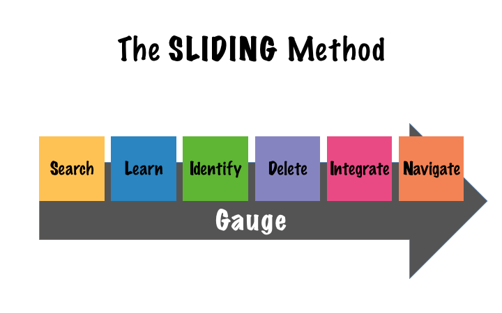
In response to question number two, if the elements of your list are part of a system or a process, then use a diagram to illustrate the relationship between the components of your list. Using Search, Identify, Learn, Delete, Integrate, Navigate, and Gauge as an example, this is how we chose to display the steps in that list using a diagram:
Fortunately, PowerPoint, comes with a large collection of diagrams (Microsoft calls them SmartArt), or if you want something slightly different (please, no 3D effects: such as volume, shades, reflections, et cetera), you can try the diagrams on sites like:
- Slideshop.com
- SlideModel.com
- PresentationPro.com
- A favourite of ours is the FREE collection at: www.duarte.com/diagrams/
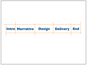
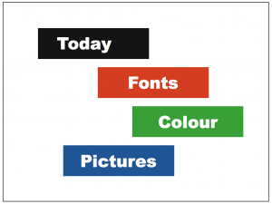
Finally, answering to question number three, to make the separation clearer while avoiding boring bullet points, you could use other design elements like blocks, position, and/or colour (or a combination of them); as these examples show:
What else can I do?
To create a more memorable and easy to follow experience for your audience you can also use animations to build your lists or diagrams. By bringing in one element at a time, your audience will pay more attention, and it will be simpler for you to talk about the list, process, or system. Consequently, it’ll be easier for your audience to absorb and remember your message.
If you found that using bullet points was unavoidable, this is the Kevlar to protect your audience from those bullet points.
Recap, please?
Make your presentation bulletproof by following these simple steps:
- Reduce the amount of text on each slide.
- Separate the elements of your list, use visual tools like space, colour, blocks, or diagrams, and then
- Introduce each of those elements separately using animations.
Join the movement; say no to bullet points!
Cheers, Gerardo.


