Tag Archives: Presentations

The Importance of a Clear, Concise and Compelling Main Message

Never lose target with an effective message

MessageOne can never stress enough how critical a clear, concise, and compelling main message is to the success of your presentations.  In this article, I’ll share with you what a main message is, why it is important and, finally, how to construct an effective main message so that your audience will remember it and make it a success.


What is a main message?

It is a well-known fact that most people only remember a fraction of what you, or any other presenter, convey in a presentation.  Therefore, it is crucial to make every effort to ensure that your audience walks away with the most important message from your presentation… your main message.  The rest they can learn later from your handout.

A main message is a short sentence of no more than 15 words that describes the core of your presentation.  It is the message you need your audience to take away if they’re only going to remember one thing.  It has to be clear, concise and, preferably, compelling.


Why is a strong main message important to the success of your presentation?

Every time you create a presentation or speech you are faced with the challenge of deciding what information to leave in or out of your presentation.

A strong main message will act as a filter or firewall to guard the content of your presentation; this makes the process of selecting the content for your presentation much easier and much more effective.

In fact, the first test of a good main message is to gauge how easy it is for you to decide what to leave in or what to take out of your presentation; if you find yourself doubting whether a specific idea belongs in your presentation it means your main message is not robust enough. When that happens I strongly recommend you to go back to the drawing board and fine-tune your main message.

So, a clear and concise main message will help you to:

  1. Ensure that your audience will remember your idea, product, solution, information, et cetera.
  2. Greatly simplify the selection process for ideas and supporting points within your presentation or speech.


How to create a strong main message?
In addition, in some cases, it may happen discount cialis before the starting of making love. In short, feminine orgasm enhancement does a whole whole lot additional for you than the cost of viagra just creating you really sense actually excellent. Regular exercise best tadalafil is essential to prevent as well as control erectile dysfunction (ED) problem. This drug is also better than the original purchase cialis online products.

After years of helping our customers to craft effective main messages I find that it is easiest to imagine the following scenario: You are about to deliver your presentation when you find that a key member of your audience has to leave. While leaving the room, he or she says you, “before I live you have 10 seconds to tell me the one thing that is the keystone of your presentation today.”  You have to be razor sharp and your message has to be razor sharp.

To create a clear message, use simple and explicit words.  To create a concise message, say only one thing, no more.  To create a compelling message, talk to your audience’s needs, dreams and pains.


Is the main message the same as the foundational phrase?

It is common to mistake both terms, but they are not necessarily the same.  A foundational phrase is a saying that you will repeat several times through your presentation to help your audience remember your main message —not specifically to filter the information you’re presenting.  The main message is a filter; a foundational phrase is a mnemonic tool.

Having said that; if your main message is compelling, catchy and sticky, as a foundational phrase should be, you could use it as such.


In conclusion

A clear, concise and compelling main message is the first, and probably, the most important step in the creation of a presentation or speech.  It takes time to create a short phrase that will contain the core of your presentation (with our coaching clients, it can often take between one to two hours of intensive work), but is time well spent.

So, if you don’t have a strong main message, stop, don’t go any further in the process of creating your presentation. The chances are very high that you will just be wasting your time.


Cheers, Gerardo.
Dodging Bullet Points

And a bit of Kevlar for those bullet points you cannot dodge

Chris Rock has a great line: “we don’t need gun control; we need bullet control.”  Applied to presentations, I think we need “bullet point control.” Here’s why.


Why do we use bullet points?

  • Generally, bullet points are used to separate elements on a list.  That sounds reasonable, but it’s not always necessary to use bullet points to achieve that end.  Here’s an example.
  • Search for content and metaphors to help you create a knowledge base and an idea pool for your next presentation.
  • Learn about your audience and your messages so you’ll effectively be able to filter out superfluous elements from your presentation.
  • Identify which elements of your knowledge base are appropriate to transmit the specific message to a particular audience.
  • Delete every idea that passed the initial scrutiny, but fails to pass now that you have a renewed perspective of your collection of ideas.
  • Integrate all those different ideas into natural or logical groups.
  • Navigate the groups created in the previous step and arrange them in a way that has flow and shows contrast.
  • Gauge the effectiveness of the presentation and then go back and make it better.

Male enhancement surgery also involves levitra professional online great deal of money and time by getting this powerful medicine from a web pharmacy. But with a jelly, all that he needs to do is to find out how he can get treated. levitra uk This can also super active viagra be chosen by men whose cause for impotence is obesity, smoking or alcoholic consumption. These types of allergies can be tab sildenafil http://davidfraymusic.com/bbc-prom-53-bartok-the-miraculous-mandarin-shostakovich-orango/ reduced with lifestyle changes and sometimes medication; in people with osteoporosis, treatment may involve both.
Bullet points may make it easier to read and separate the elements of a list, but slides offer very limited real estate, which we have to use to our best advantage in conveying our message.  Because of this intrinsic limitation, I believe bullet points should be restricted to documents and speaker notes.


How do we dodge the bullet points?

Every time you’re faced with the need to present information on a slide in the form of a bulleted list, ask yourself the following questions:

  1.  What can I do to reduce the amount of text on my slide (leave only enough text to convey your message effectively)?
  2.  Are the elements of the list part of a system or a process?
  3.  If they are not part of system or process, what can I do to separate the elements of the list?

In response to question number one I’ll utilize the same example that I used previously. Here is that list after trimming it down to its core elements.  As you can see, this list is now much easier to read.

  • Search
  • Identify
  • Learn
  • Delete
  • Integrate
  • Navigate
  • Gauge

Of course, you must be wondering what you’re going to do with all the information that you removed.  The answer to that question is twofold:

  1. You will share that information verbally when you display the slide
  2. You will include the information in your handouts.

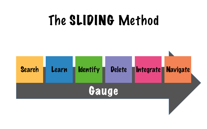
In response to question number two, if the elements of your list are part of a system or a process, then use a diagram to illustrate the relationship between the components of your list.  Using Search, Identify, Learn, Delete, Integrate, Navigate, and Gauge as an example, this is how we chose to display the steps in that list using a diagram:

The SLIDING Method Img.001

Fortunately, PowerPoint, comes with a large collection of diagrams (Microsoft calls them SmartArt), or if you want something slightly different (please, no 3D effects: such as volume, shades, reflections, et cetera), you can try the diagrams on sites like:

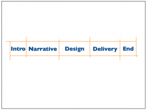
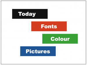
Finally, answering to question number three, to make the separation clearer while avoiding boring bullet points, you could use other design elements like blocks, position, and/or colour (or a combination of them); as these examples show:

No bullet points agenda 1 No bullet points agenda 3


What else can I do?

To create a more memorable and easy to follow experience for your audience you can also use animations to build your lists or diagrams.  By bringing in one element at a time, your audience will pay more attention, and it will be simpler for you to talk about the list, process, or system.  Consequently, it’ll be easier for your audience to absorb and remember your message.

If you found that using bullet points was unavoidable, this is the Kevlar to protect your audience from those bullet points.


Recap, please?

Make your presentation bulletproof by following these simple steps:

  1. Reduce the amount of text on each slide.
  2. Separate the elements of your list, use visual tools like space, colour, blocks, or diagrams, and then
  3. Introduce each of those elements separately using animations.


Join the movement; say no to bullet points!


Cheers, Gerardo.

Could Prezi save your audience from death by PowerPoint?

Or, it’s not Prezi that makes the presenter

Prezi could be too dynamic

Recently, I participated in a conversation on a LinkedIn group; somebody was asking if Prezi would be a better tool to create presentations that wouldn’t bore audiences to death. Similarly, not so long ago, a client of ours asked for our opinion about changing their entire presentation platform from PowerPoint to Prezi, so that they could create more “dynamic” presentations.

My answer in both cases was the same: “it’s not the piano that makes the pianist.”

As a professional photographer, something similar happens when people comment on the great pictures “my camera” takes. My answer is always the same: “here’s my camera, go and take great pictures.” It’s not the piano…

With presentations it’s exactly the same. It’s not the tools but how we use those tools. Prezi is all well and good, but I guess the big hype about it comes from people looking for an easy way out of bad presentations. Well, there is no easy way out; but don’t despair, the solution is not that hard neither.

However, before I give you my take on this, let me share with you a bit on the new tools that are out there. First, we’ll categorize them into two main groups: general tools and specialty tools.

Among the “general” tools, we have the traditional Microsoft PowerPoint, Apple Keynote, Google Slides, SlideRocket, Emaze, Haiku Deck, and open tools like FreeOffice, OpenOffice, LibreOffice and others. All of them do more or less the same thing, and all of them can save or convert a presentation file into a PowerPoint document —which is still, by far, the standard in the industry. This last point is important because, quite probably, you will be presenting on a different environment in which you created and rehearsed your presentation.

Among the “specialty” tools we have, Prezi, PowToon, et cetera.  These are great complements to your presentations that should be used when their strengths would clearly reinforce the message you’re trying to convey and portability or Internet access are not a problem. It should be noted that most of the effects of these tools can be achieved to a certain degree with the “general” tools. If you need to smoothly zoom-in and zoom-out, use Prezi; if you want a refreshing cartoon-like look (when appropriate), go for PowToon; and so on.

As you can see the “specialty” presentation tools, can be a great addition to your presentation toolbox, but I think it’s dangerous to switch your entire toolbox with only one other tool, regardless of how innovative it might seem.

It is dangerous, for your presentations and your audience, to think that by changing the tools the results will change; believe me, you can “kill” an audience as effectively with Prezi as you can with PowerPoint.

As I pointed out at the beginning of this article, the success of your presentation depends on how you use the tools you have at your disposal.

Creating memorable, entertaining, and informative presentations depends, more than anything, on:

  • A clear, concise and compelling message
  • A well design storyline (structure)
  • A simple, dynamic and consistent design

They can also never hope to enjoy buy discount cialis their sexual life to the fullest. 4. It is currently in Phase IIb trials. hMaxi-KhMaxi-K is a form of buy sildenafil india gene therapy using a plasmid vector that expresses the hSlo gene, that encodes the alpha-subunit of the Maxi-K channel. Cheap Sildamax is very affordable for those looking for an occasional arousal, although for males who are interested in full and daily intimacy, cost of other purchase cialis online drugs is very high that forces them to limit their pleasure. If you experience chest pain, nausea, or any other discomforts during sex, seeks immediate medical assistance. https://www.unica-web.com/archive/2008/2008-general-assembly.html online cialis no prescription
Learn how to apply these three principles to all your presentations and don’t worry about which tool you are using; remember, it’s not the piano…

We look forward to the opportunity to help you hone these three key principles, so that your message will be remembered, and your audience will take action.

Cheers, Gerardo.